Making Open-Source Accessible for All
How a small open-source contribution made search accessible to blind developers in technical documentation sites.
Do you make your open-source projects accessible? Let’s be honest: it’s rarely a priority. We can blame the lack of learning resources, poor tooling, or pretend that our project’s audience doesn’t include people with disabilities. The truth is, many of us only hear of accessibility when it’s brought up as a “business requirement”.
I’d like to change your perception of accessibility as a developer.
By reading this article, you will:
- Discover why accessibility is not just for disabled people.
- See how a contribution to an open-source project made hundreds of documentation sites accessible to blind users.
- Get reference points to start making your projects accessible.
- And, hopefully: shift your priorities by including accessibility earlier in the design process of your projects.
Prelude: Why Even Bother About Accessibility in Open-Source Developer Tools?
By making your tool accessible to the blind and low-vision users, you automatically gift all of your users with an awesome keyboard experience (and believe it or not, some developers are blind).
Although this article focuses on no-vision users, accessibility isn’t just about blind people. I really like this persona spectrum matrix from Microsoft that helps foster empathy in a thoughtful way:
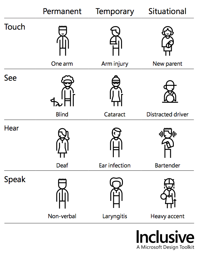
I really like the principles behind the open-source community and absolutely love its diversity. I also believe that accessibility should be part of the fundamental goals of the community if it wants to live by its standards as an inclusive and collaborative group.
Designing for inclusivity not only opens up our products and experiences to more people with a wider range of abilities. It also reflects how people really are. All humans are growing, changing, and adapting to the world around them every day. We want our designs to reflect that diversity. — Microsoft
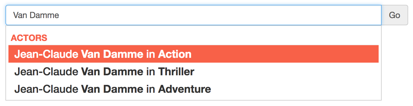
DocSearch
If you’re using React, Babel.js, Vue.js, ESLint or Scala, there’s a high probability that you’ve been searching their technical docs using a service called DocSearch. DocSearch is provided by search-as-a-service company Algolia, and makes instant search available for free to all open-source projects for their documentation. And it’s getting big!
DocSearch powers 3+ million searches a month!
When I implemented DocSearch on www.lightningdesignsystem.com (Salesforce’s Lightning design guidelines, CSS framework and user interface components), we quickly realized it wasn’t really accessible to screen reader users. At Salesforce, a solution that isn’t accessible will be heavily frowned upon… or even dropped! Two of my colleagues are blind and I felt quite guilty to leave this search field unusable by them for such a long time.
The guilt was growing and my conscience kept reminding me I should do something about it, so in January 2017, I managed to get 5 days away from my normal day job to work on making DocSearch accessible and get some experience with screen readers. (by the way: a massive thanks to my employer, Salesforce, who allows employees to work a few days a year on community-driven projects)!
I got to work at Algolia’s San Francisco office where I thought I’d make more impact and improve the empathy for screen reader users. Their culture is very welcoming for an initiative like this.

1. The Setup
Screen readers
The first step was to install a few screen readers.

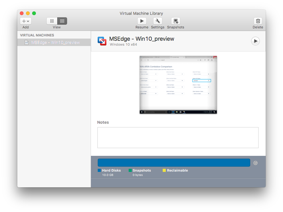
After bumping into a lot of installation issues, here’s my setup (I work on a Mac and use VirtualBox to load Windows virtual machines from modern.ie):
- macOS: VoiceOver
- Windows 7: JAWS (Win7 IE11 VM)
- Windows 8.1 / IE11: NVDA (Win8.1 IE11 VM)
- Windows 10 / Edge: Narrator (Win10 Edge Preview VM)
Unfortunately I couldn’t get the audio to work in my Windows 10 virtual machine using VirtualBox. So I reverted to VMWare.

Getting Windows 10 and Narrator to work on a Mac:
- Download and install VMWare Fusion (free 30 trial)
- Download the Windows 10 virtual machine compatible with VMWare Fusion at http://modern.ie
- Unzip the file (4.7GB)
- Open MSEdge — Win10_preview.vmx (in the MSEdge.Win10_preview.VMWare directory)
- Once Windows 10 has booted, the VMWare Tools should get installed and ask you to restart your machine. Follow instructions on the screen and restart the VM
- Once the VM has finished rebooting, the sound card should be operational. Shut the VM down (right click on the Start menu > Shut down or sign out > Shut down)
- Manually add the sound card (VM settings > Add Device > Sound Card)
- Start the VM again
- Search for “Narrator” in “Ask me anything” (Cortana)
- Open Narrator
Congratulations, you can now test Narrator for free during the next 30 days!
Local development environment
The search field and its autocomplete function are generated by a combination of two projects: Autocomplete.js and DocSearch. My first step is to get both of them running on my machine. Algolia uses GitHub, Node.js, npm and yarn to host and build their front-end packages. These are popular choices, which made it very easy to run Autocomplete locally and DocSearch (and later on, to contribute to the projects):
- Fork the repositories on GitHub.
- Clone the repositories locally and install all dependencies:
npm i -g yarn
git clone https://github.com/kaelig/autocomplete.js
cd autocomplete.js
yarn
yarn dev
git clone https://github.com/kaelig/docsearch
cd docsearch
npm install
npm run dev
3. Link the autocomplete.js npm package for local usage during development in the DocSearch package:
cd autocomplete.js
npm link
cd docsearch
npm link autocomplete.js
Thanks to npm link, any change in the autocomplete.js local copy gets reflected in the local DocSearch environment.
That’s it! I was now ready to code and run some tests.
2. The Mission: Adding Keyboard Accessibility in autocomplete.js
My first tests showed that the lack of aria-* attributes and proper role tagging made screen readers unable to understand the relationship between the search field and the associated list of suggestions:
Side note: what is ARIA?
WAI-ARIA, the Accessible Rich Internet Applications specification from the W3C’s Web Accessibility Initiative, provides a way to add the missing semantics needed by assistive technologies such as screen readers. ARIA enables developers to describe their widgets in more detail by adding special attributes to the markup. Designed to fill the gap between standard HTML tags and the desktop-style controls found in dynamic web applications, ARIA provides roles and states that describe the behavior of most familiar UI widgets.
— Mozilla, An overview of accessible web applications and widgets
1. Disabling the browser’s autocomplete feature
The autocomplete feature is handled via JavaScript, so we’re going to set autocomplete="off" to make sure the browser doesn’t show a list of results on top of ours.

However we still want to signal to the screen reader that there is in fact an autocomplete. We’re going to do that using aria-autocomplete (both and list).
<!-- A list of choices appears and the currently selected suggestion also appears inline -->
<input type="text" autocomplete="off" aria-autocomplete="both">
<!-- A list of choices appears from which the user can choose -->
<input type="text" autocomplete="off" aria-autocomplete="list">
2. Basic semantics: combobox & listbox
This pattern (field + list of options) is called a combobox and presents itself as a select to screen readers.
<input type="text" role="combobox">
The list of suggestions is called a listbox and each suggestion is an option:
<ul role="listbox">
  <li role="option">…</li>
  ...
</ul>
Compromise: Ideally, you’d use an unordered list (ul, li) like in the example, but in DocSearch we’re dealing with a span and divs. I didn’t want to introduce any breaking change so I kept it as span and div, and the result for screen readers seems to be identical.
3. Building a relationship between the combobox and the listbox
We need to explicitly specify a relationship between that input and this list of suggestions:
<input aria-owns="suggestions" ...>
<ul id="suggestions" ...>
aria-owns points to “suggestions”, the ID of the element with role="listbox". Now there is a semantic link between both controls!
Note that aria-owns and aria-controls both seem to create that relationship, but I chose to use the safer, older, aria-owns.
The input also needs to specify when the combobox is expanded or collapsed:
<!-- The listbox is collapsed -->
<input aria-expanded="false" ...>
<!-- The listbox is expanded -->
<input aria-expanded="true" ...>
4. Selected state
When the user browses result suggestions using the up/down arrows, we need to provide a way for the screen reader to know which option is selected.
Two things need to happen here:
- The
<li role="option">gets anaria-selected="true"state attribute, - The
<input role="combobox">gets anaria-activedescendantvalue equal to the ID of the selected option.
<input aria-activedescendant="option-1"><li id="option-1" aria-selected="true">
5. A few extras
Let’s make sure the browser isn’t interfering with the user’s input as they type, so their search experience can be smooth as their keyboard is dedicated to typing and navigating results:
<input
  autocorrect="off"
  autocapitalize="off">
Piecing it all together
This is what the DOM should look like (once the user has entered a term in the search field):
That’s a lot of attributes, but totally worth it.
3. Testing (and Getting Frustrated)
Running tests across all screen readers and browsers is the tedious part of the process. My first attempts at making a search field accessible were unsuccessful. Testing early and often as it allowed me to quickly correct trajectory: sometimes I did something wrong, and some other times the browsers and the screen readers themselves were at fault.
The more I understood how to build an accessible combobox and the differences between each browser/screen reader combination, the more I felt like when I was building HTML newsletters and websites in the 2000’s: when heterogenous client and browser landscapes came in the way. Nowadays, browsers are much better at a lot of things (performance, spec-compliance, security), but accessibility doesn’t seem to have been given the same level of attention.
Here are a bunch of issues I encountered:
VoiceOver
VoiceOver is Apple’s built-in screen reader for iOS and macOS. It’s free and really easy to use. However, it’s far from perfect (one of my blind colleagues left macOS for that reason).
In Safari, VoiceOver won’t read the currently selected option, but the previously selected one instead, making search barely usable. My colleague Adam still managed to use it with a combination of VoiceOver + a braille keyboard, which didn’t seem that straightforward.
I’ve opened a bug on the WebKit tracker, let’s hope it gets fixed soon.
Chrome won’t expose the combobox+listbox controls to VoiceOver, resulting in a completely silent output.

NVDA
I haven’t encountered any particular issues with NVDA, aside from the fact it sometimes reads a few too many things in Internet Explorer 11.
JAWS
The JAWS/IE11 combination seems particularly verbose and says “blank” before reading each option, and IE11 doesn’t satisfy the aria-hidden="true", so JAWS ends up reading things that shouldn’t be read.
Chrome, and especially Firefox, seem to have a much better integration with JAWS.
Narrator
Microsoft’s screen reader for Windows 10 delivers a great experience with its browser, Edge. Note: I haven’t tested in Chrome or Firefox yet.
My 2 favorite browser/screen reader combos
Some screen readers / browser combinations are either too verbose or not enough. Two combos seemed to strike the right balance (from my non-expert point of view):
- Firefox/JAWS produced really good results, and this combo is the one I used to demo the accessible search field to the Algolia team.
- Edge/Narrator is really easy to use and doesn’t repeat information that I had already heard once — and it comes with Windows!
4. Checking the results in production
Once my two pull requests (one PR in Autocomplete.js and the other PR in DocSearch) had landed, it only took a few minutes for all documentation sites would get the new and improved version. Now it was time to make sure I didn’t break anything and that the accessibility fixes actually worked.
Turns out, there are a lot of sites using DocSearch! I had to target my efforts. I chose to test the documentation sites that attract the most traffic.
During my test, I found that not all the sites were using the out-of-the-box DocSearch experience, but I’m pretty happy to announce that these well-known sites now feature an accessible search field:
- Apiary
- Batch
- Ember.js
- GraphQL
- InfluxData
- Mailjet
- Preact
- Quill
- React
- React Native
- Salesforce Lightning Design System
- Scala
- Stylelint
- Symphony
- Vue
- Webpack

Conclusion
I’ll admit that the lack of up-to-date learning resources and the buggy tooling are rather frustrating obstacles. But making an interface accessible isn’t rocket science, and you can do it too.
As a closing thought, I hope this article helps demystify accessibility, and encourages more teams to care about it when they release (developer) tools, so everyone can enjoy an amazing developer experience regardless of their abilities and disabilities.
Further reading
- How to Describe Complex Designs for Users with Disabilities
- WAI-ARIA: Best Practices for Authoring Accessible Web Applications
- Sean Giles wrote about this same topic a few years back: “Why open source needs accessibility standards”
Thanks
Making autocomplete.js accessible would have been a lot harder if I hadn’t had these great examples and people to rely on:
- combobox comparison from my colleague Simon Taggart, accessibility engineer at Salesforce,
- combobox example from James Craig, accessibility expert at Apple.
- Maxime Locqueville, the engineer who answered every question I had about the architecture of Algolia, Docsearch and autocomplete.js, allowing us to work smarter!
Addendum: compromises and future improvements
I wanted the changes to be backwards compatible with existing installations of DocSearch and it wasn’t possible to make major markup changes, so I had to make a few compromises:
- The changes were targeted at no-vision users. Low-vision usability is also important but it was outside of the scope of this work. I’d encourage designers at Algolia to prioritize this and make sure color contrast and text size are sufficient.
- In my pull request, I kept
spananddivelements whereulandlielements would have done a better job at making semantic sense. - My changes were based on the ARIA 1.0 specification, and if future versions of Autocomplete.js allow for more markup changes, I’d encourage contributors to look at the ARIA 1.1 spec. For future reference, this article from Bryan Garaventa sums up the differences and talks about screen reader support: Differences between ARIA 1.0 and 1.1: Changes to role=”combobox”.